We had a quiet weekend. By this I mean we were out and about. Tim worked on the insulation in the new basement ceiling and got that finished! I puttered.
I am finally ready to get our bedroom design going, and the office, too.
For our bedroom I am looking at having Tim do either picture frame molding or board and batten. I'm trying to decide. I think I'm leaning toward board and batten as it is more cottage style, and that feels more like me. I definitely like English Country style in my home.
I've been looking at colors on Pinterest and really like a deVOL Kitchens color called Refectory Red. It's a deep, grown up red. It may be too much for a primary bedroom, but if the lower portion of the wall, say 2/3 was creamy white board and batten?
This is Refectory Red.
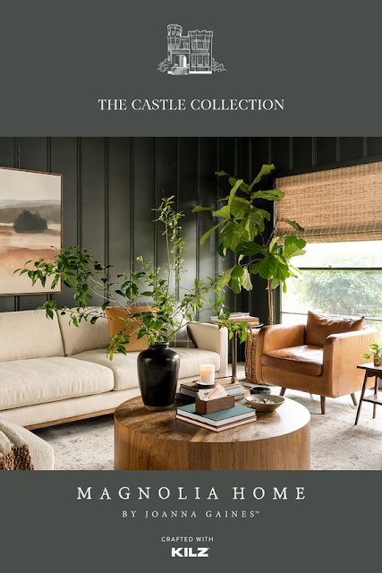
On the other hand there are these lovely greens.
Cottage Grove by Joanna Gaines for Kilz Castle Collection.
Or Retreat by Sherwin Williams
Decisions, Decisions.
Here is my hutch in the kitchen. I am going to change out the knobs and pulls. It's very fun and handy to have.
I have mug hangers coming for the upper shelves and I am going to move some of that tea so it doesn't look so cluttered.
Tim has a big work project this week. They are hooking a house from a septic system to public sewer.
Tomorrow is our granddaughter Kennedy's 3rd birthday! I bought her a book and a tea set!
Isn't it cute?
All of the images of colors can be found on my For The Home Pinterest page{here}.


6 comments:
So difficult to choose colors. My kitchen and bathroom are white, but the rest of the apartment has pale gray walls and celadon green trim. Pale gray is great and rarely shows smudges.
Deanna, I am sure that you are enjoying the design process for your bedroom and office! We are looking for paint colors too. At the Farmhouse, I had a good feel for what I wanted and what would look good. At Pineapple House, I'm not as confident. I am going to grab those two color strips tomorrow . . . thanks for posting them!
Your new cupboard is so pretty! Yes, that red color you showed will make it beautiful. I had our ACE Hardware paint store mix up a Benjamin Moore color from the Williamsburg collection that might be called something like Colonial Red. I have my kitchen stools painted that color and it's so lovely. I actually started out with a large 23 x 30" piece of artboard from Michaels' that I wanted to make for my own photo mat background that they color matched to. If you look back at some of my Instagram photos you'll see the photo mat in the "Houses" picture. Your home is so lovely. Thank you for sharing.
Love everything about your house! And LOVE the tea set! She'll love it!
hugs
Donna
Well, I will be pinning that red for sure!! It's dreamy...
i'm not a red gal but i can see where that deep tone would be absolutely beautiful. :) (love the deep magnolia castle green tone)
Post a Comment